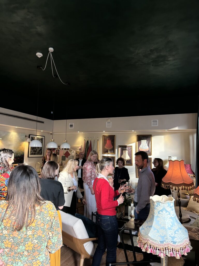
There’s always a moment at a launch where the story behind a piece clicks into place — not through a press release, but through the people themselves. Last night, seeing the Tinker & Tallulah x Nina Watson collaboration in the flesh, that moment came quickly.
Nina spoke with real clarity about the starting point: a search that never quite delivered. She described how she had never been able to find the most perfect red lampshade in a classic shape, something that felt considered, balanced, and right within a layered interior. It wasn’t about making a statement piece for the sake of it, but about filling a quiet gap that, once noticed, becomes impossible to ignore.
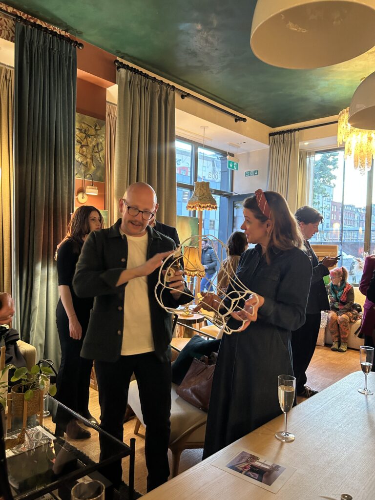
What followed was less a brief and more a shared challenge. Tinker & Tallulah stepped into unfamiliar territory, working with a new silhouette alongside Nina Watson, a challenge Liam took on with ease. Almost as if by magic, Nina’s design drawings were translated into real life with remarkable precision and finish.
Even the name carries that sense of instinctive collaboration. After the final pieces were delivered and the collection sat together in Nina’s home, Rach from Tinker & Tallulah called Nina Watson with an immediate reaction — they look like sweets. Nina, instinctive and self-professed magpie, didn’t hesitate in her response: no, they look like jewels. And just like that, the collection was named.
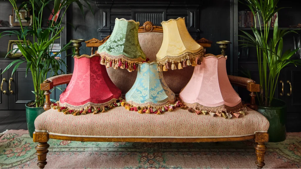
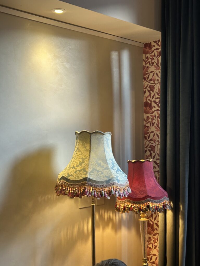
Seeing the shades together, it makes sense. Ruby, Emerald, Topaz, Citrine and Rose Quartz aren’t literal translations, but tonal cues — deep reds, teals, softened pinks, and warm yellows that feel considered rather than decorative. Each piece carries a palette within itself, particularly through the trims and fringing, allowing it to sit comfortably across different schemes. Nina described them as almost interchangeable, designed to move between rooms and interiors without friction.
That idea of versatility sits at the centre of the collection. These are pieces designed to layer, to work within a space rather than dominate it. Nina’s thinking, heritage reconsidered, comes through in the use of traditional damask-inspired fabrics that don’t announce themselves loudly but instead build quietly within a room. Lighting, as she put it on the night, is the jewellery of a room, it brings atmosphere, glow, and something harder to define. These shades understand that role.
Up close, the craftsmanship holds its own. Each lampshade is handmade to order in Nottinghamshire, with an attention to detail that feels deliberate rather than ornamental, precise pattern placement, clean finishes, and the signature swish of tassels that add movement without excess.
But more than anything, what stood out at the launch was how naturally the collaboration sits. There’s a shared sensibility between Tinker & Tallulah’s approach to making and Nina’s way of designing interiors that people genuinely live in. Nothing feels forced, and that’s often the hardest thing to achieve.
It’s early days for The Jewel Collection, but seeing it first-hand, it already feels like something that will settle into homes with ease, not as a focal point demanding attention, but as something that quietly completes a room.
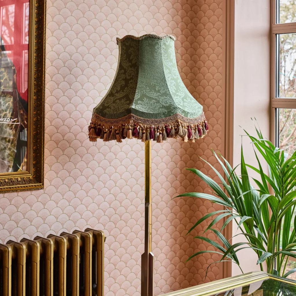
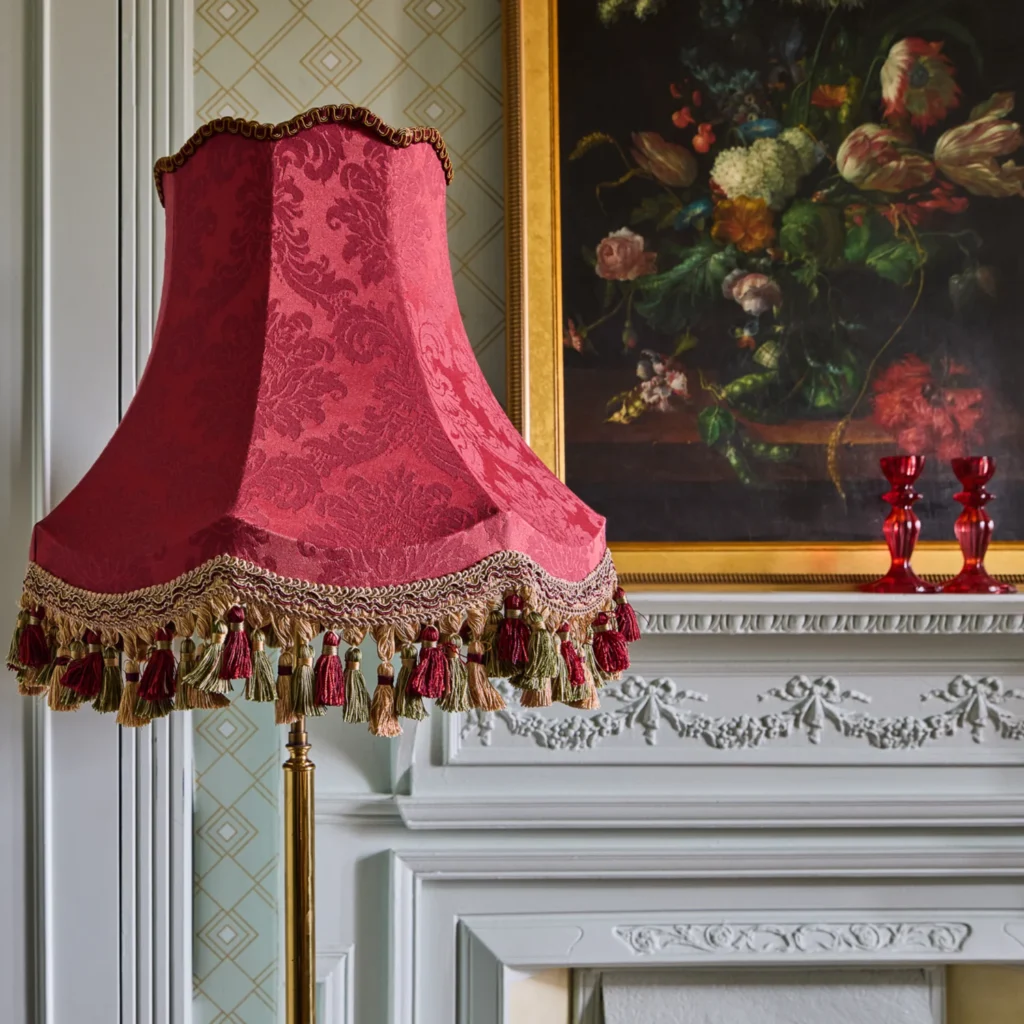
The Jewel Collection
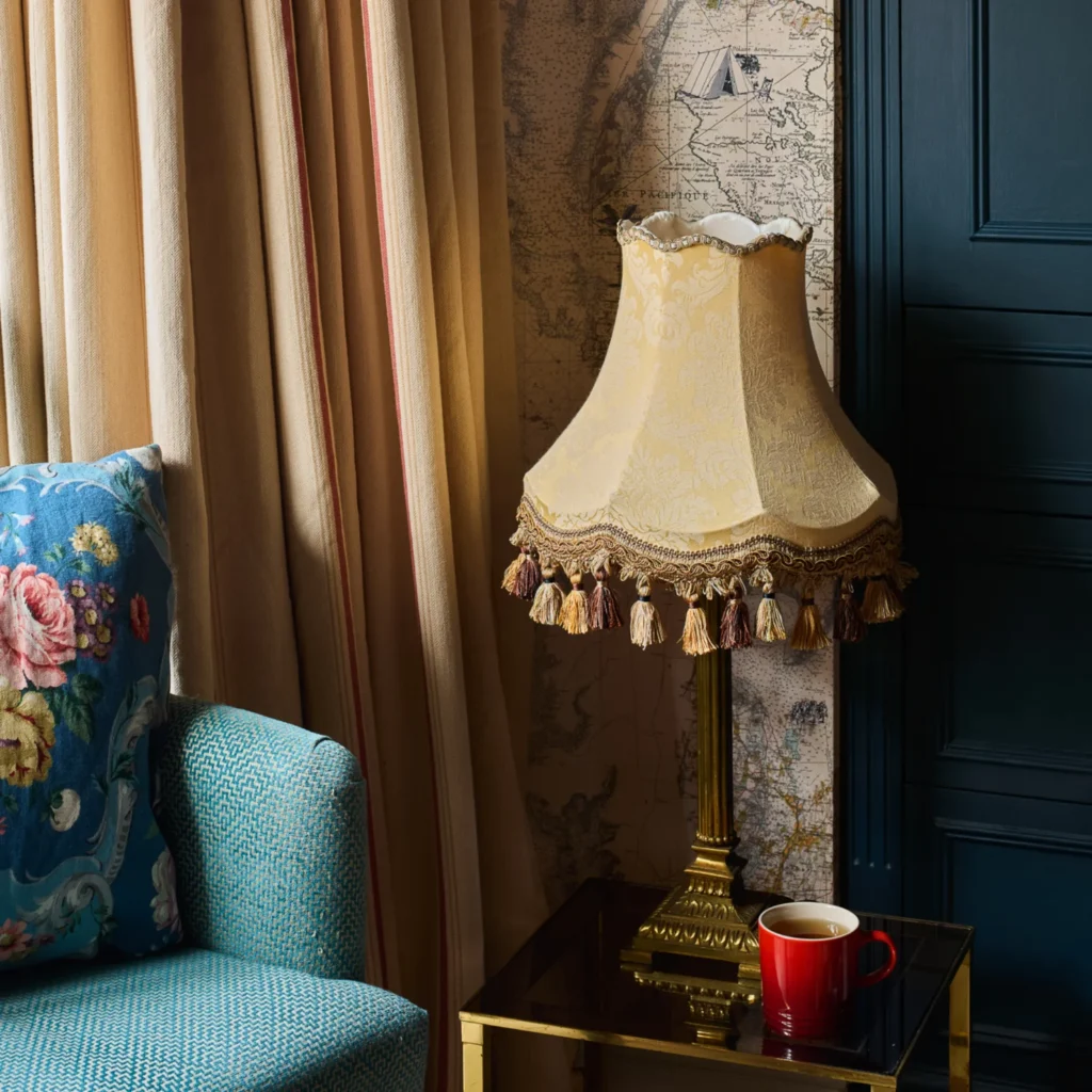
The Citrine
A golden yellow with a soft, sunlit quality that adds warmth and lifts a room without feeling too bold.
The Emerald
A rich, grounded green that brings depth and balance to a space, reimagining a classic design in a way that feels both timeless and contemporary.
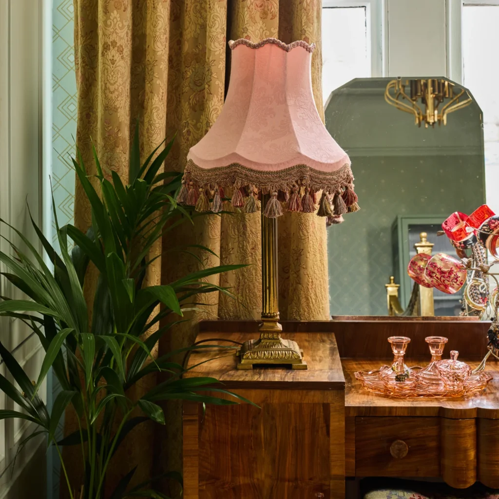
The Rose Quartz
A soft, characterful pink that exudes warmth and lightness – a beautifully understated way to introduce colour into your scheme.
The Ruby
A warm, expressive red with a natural depth that adds presence without overpowering a space, bringing rich colour with a hint of drama.
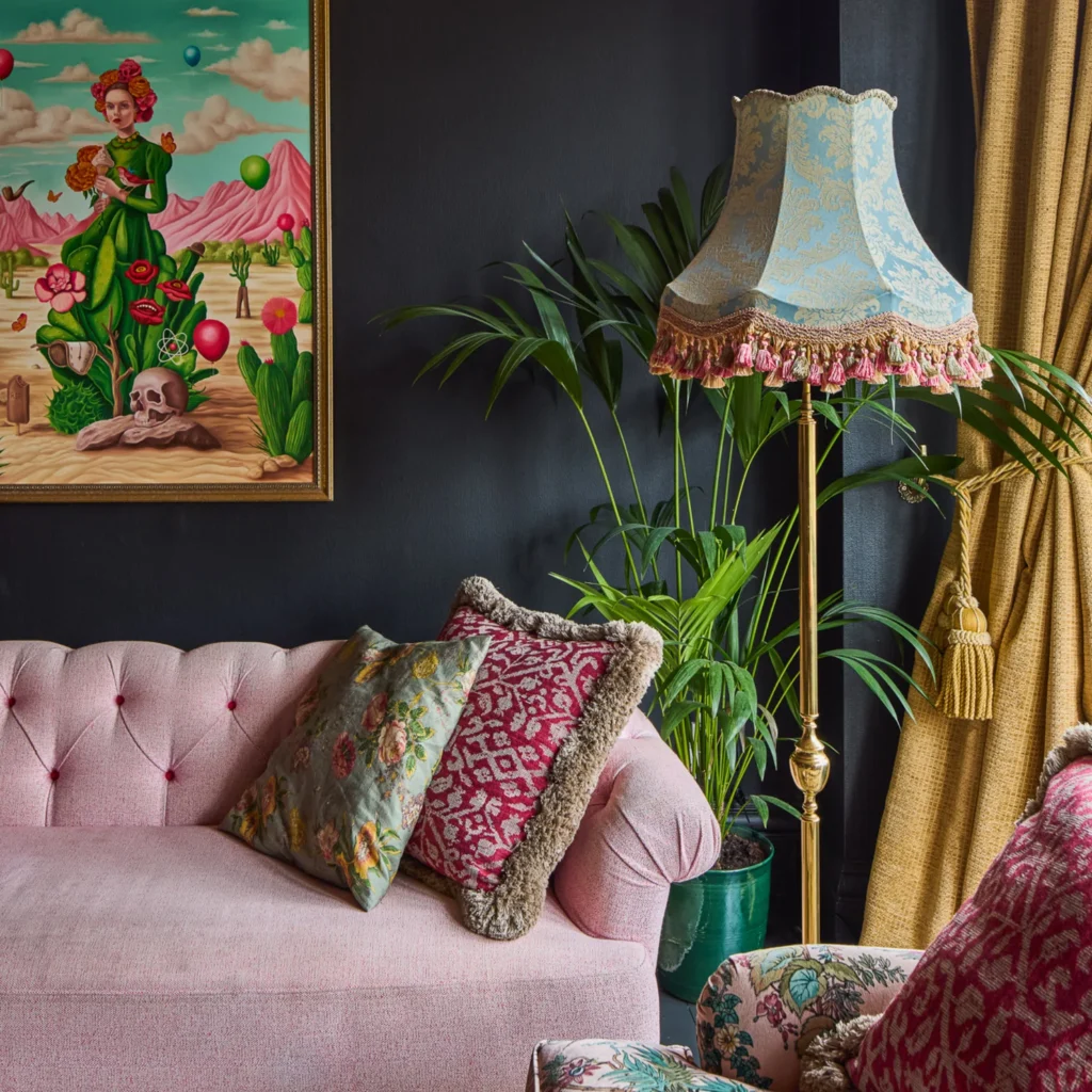
The Topaz
A soft blue and cream pairing that plays with contrast and colour in a considered way, adding depth and quiet interest to a space.